


My Stuff.
Thundercats are GO!
However you get their attention, what matters is what you do with it.
My Stuff.
Thundercats are GO!
However you get their attention, what matters is what you do with it.
Personal Work
Personal Work
Personal Work
Personal Work
People Power Gym
PPG is a totally independent, fully membership + donation funded, free-to-the-people self-defense program for marginalized communities in Philadelphia’s poorest neighborhood. We began last winter with a punching bag we found in a church basement, some office space a friend lent us and a single instructor. By the summer we managed to move into a full class space, and buy a full room of mats, gloves, and equipment, 3 instructors (including a black belt), and classes 6 days a week in boxing, grappling, yoga and more.

I serve on the steering committee, and help with certain responsibilities such as video editing and some social media, but my biggest roles is in the design and production of all merch and collateral. Flyers, posters, stickers, buttons, and these lovely red t-shirts.
For more info on PPG Check out our Facebook and our Instagram
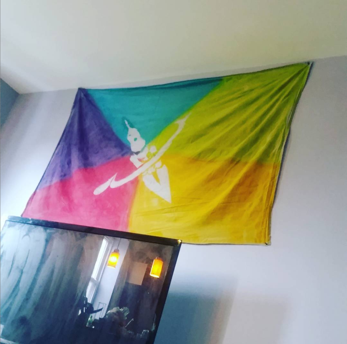
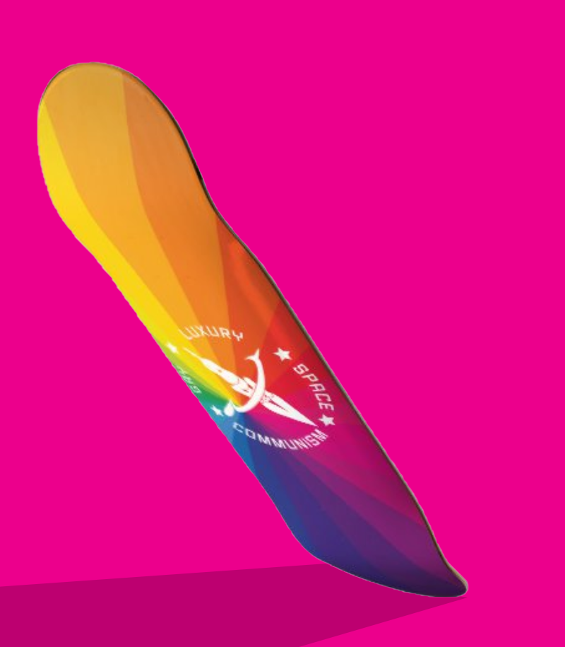
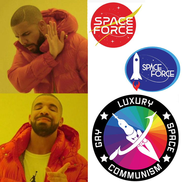
Luxury Gay Space Communism
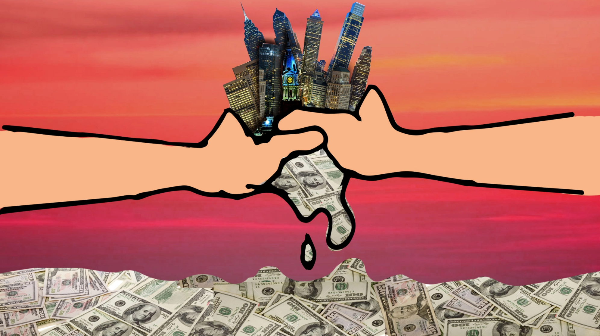
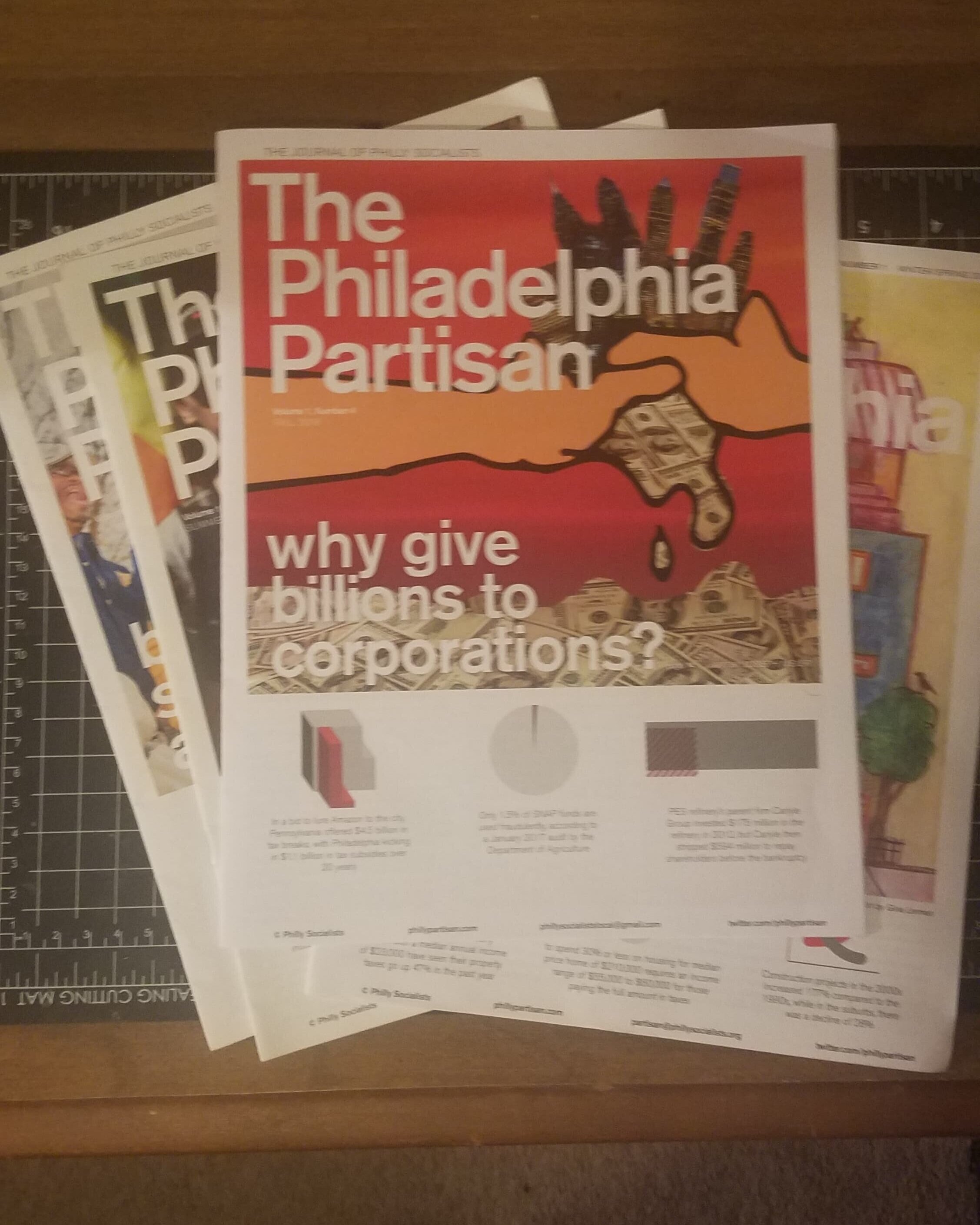
Over the a few years of throwing sometimes aggressively branded house parties, I noticed that the more heavily I branded my parties, the better of a time people seemed to have. Naturally i decided to take some time to really max one out. I designed a badge, a flag, a snapchat filter, even a little pamphlet on the tenants of Luxury Gay Space Communism. The stickers proved so popular I began making patches and selling them online. Eventually a local organization focused on building community and worker power in Philadelphia (which I’ve since begun organizing with) approached me about getting their own run to offer as recruiting gifts.
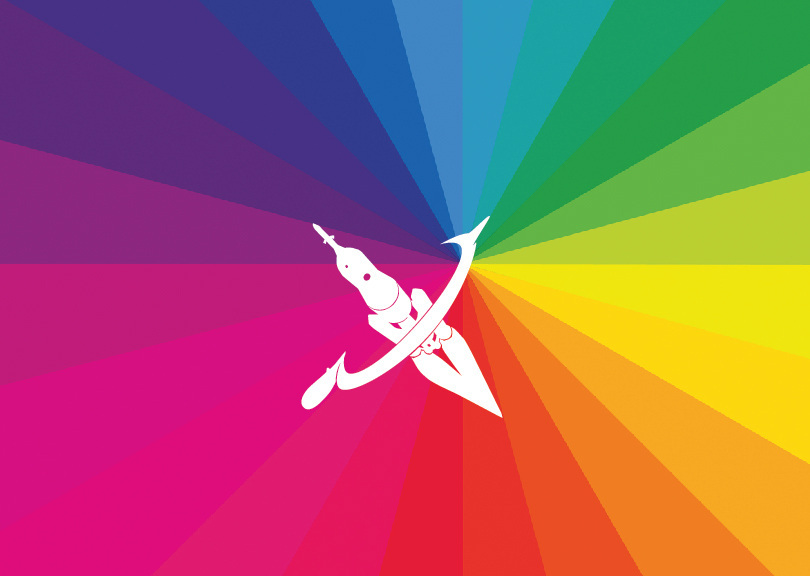
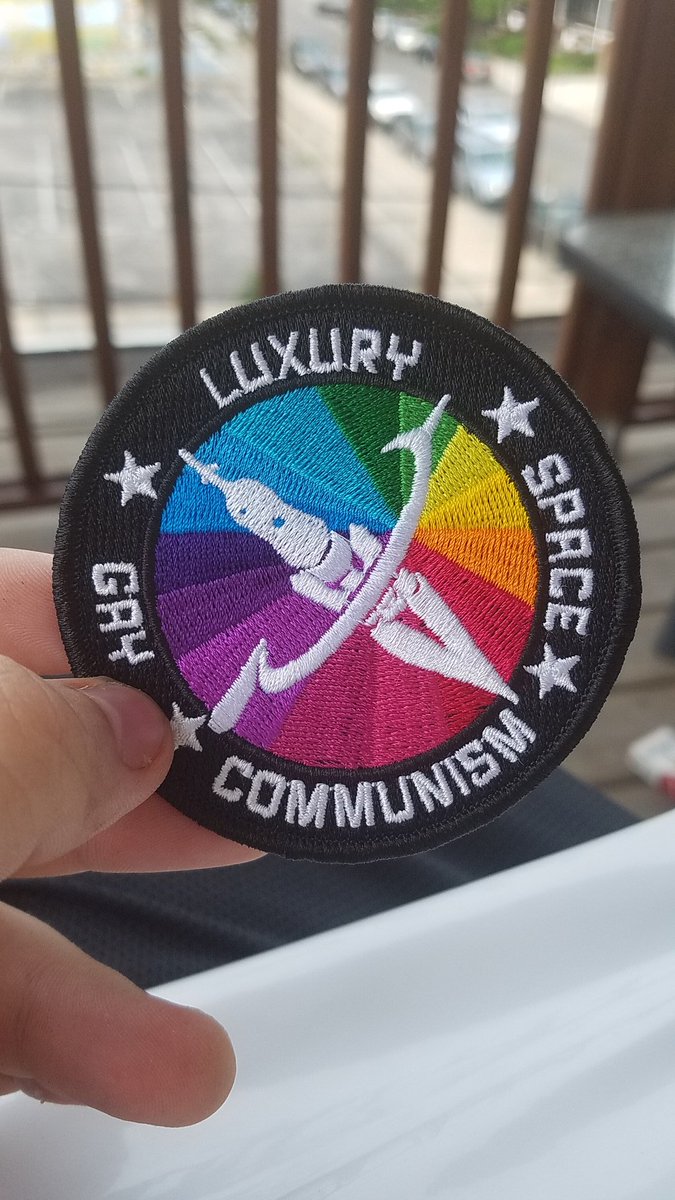
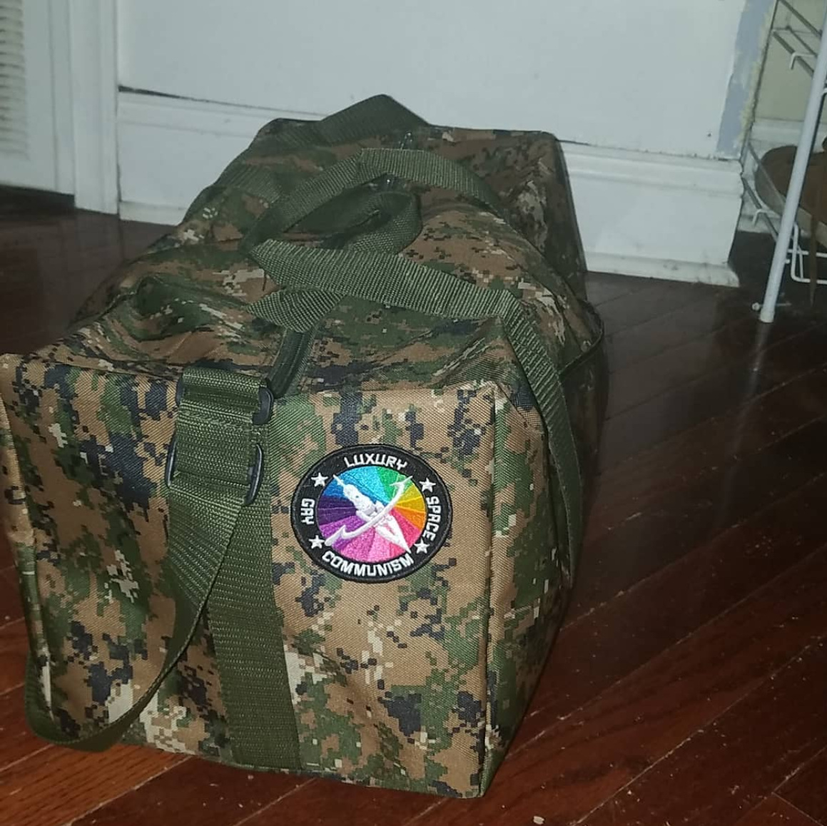
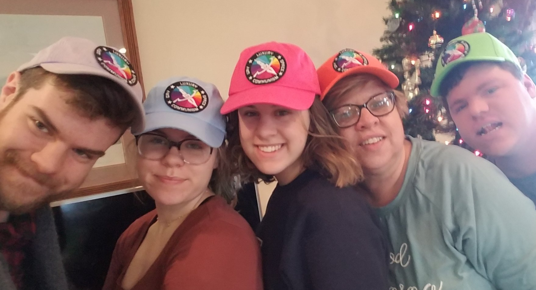
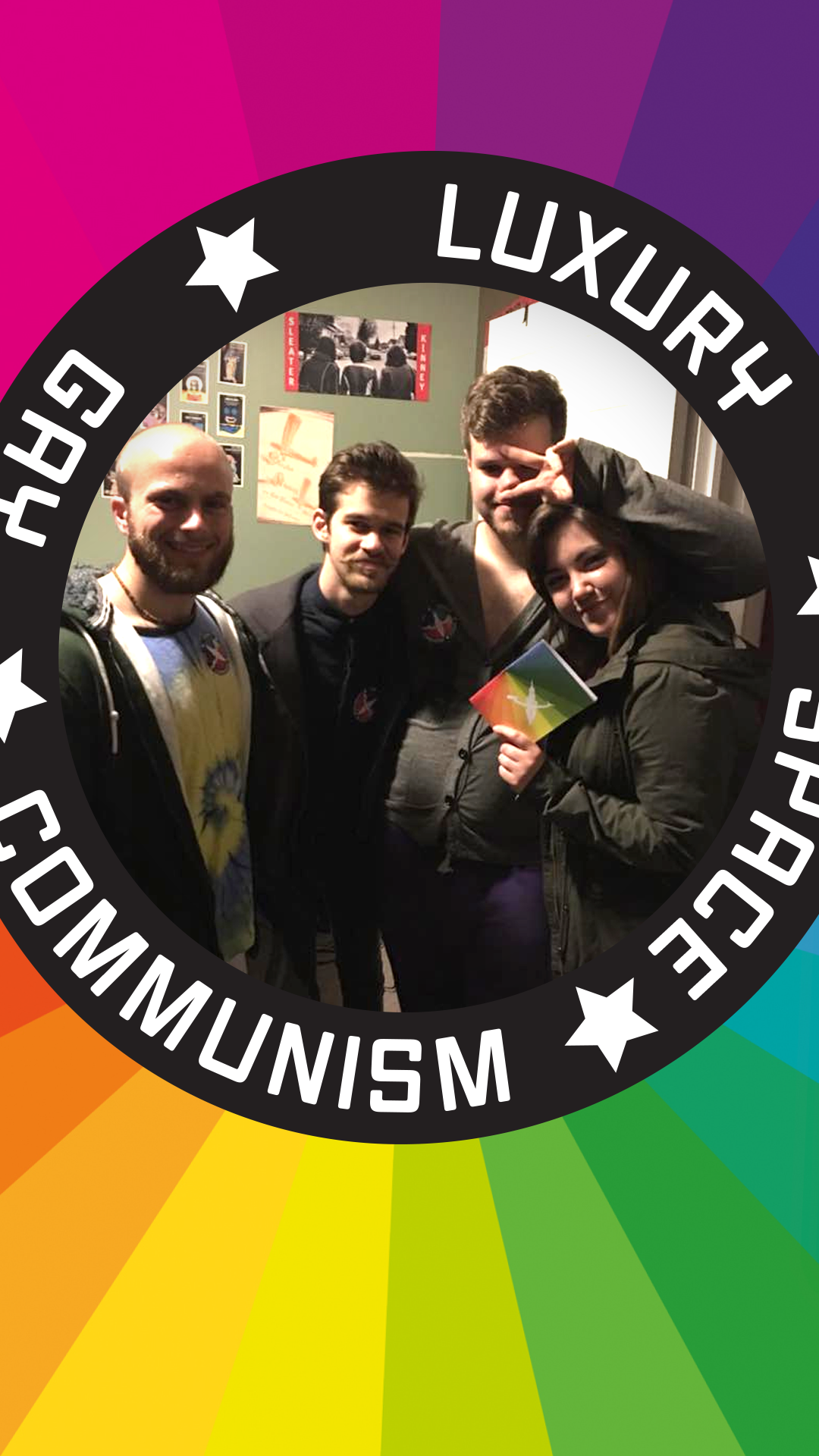
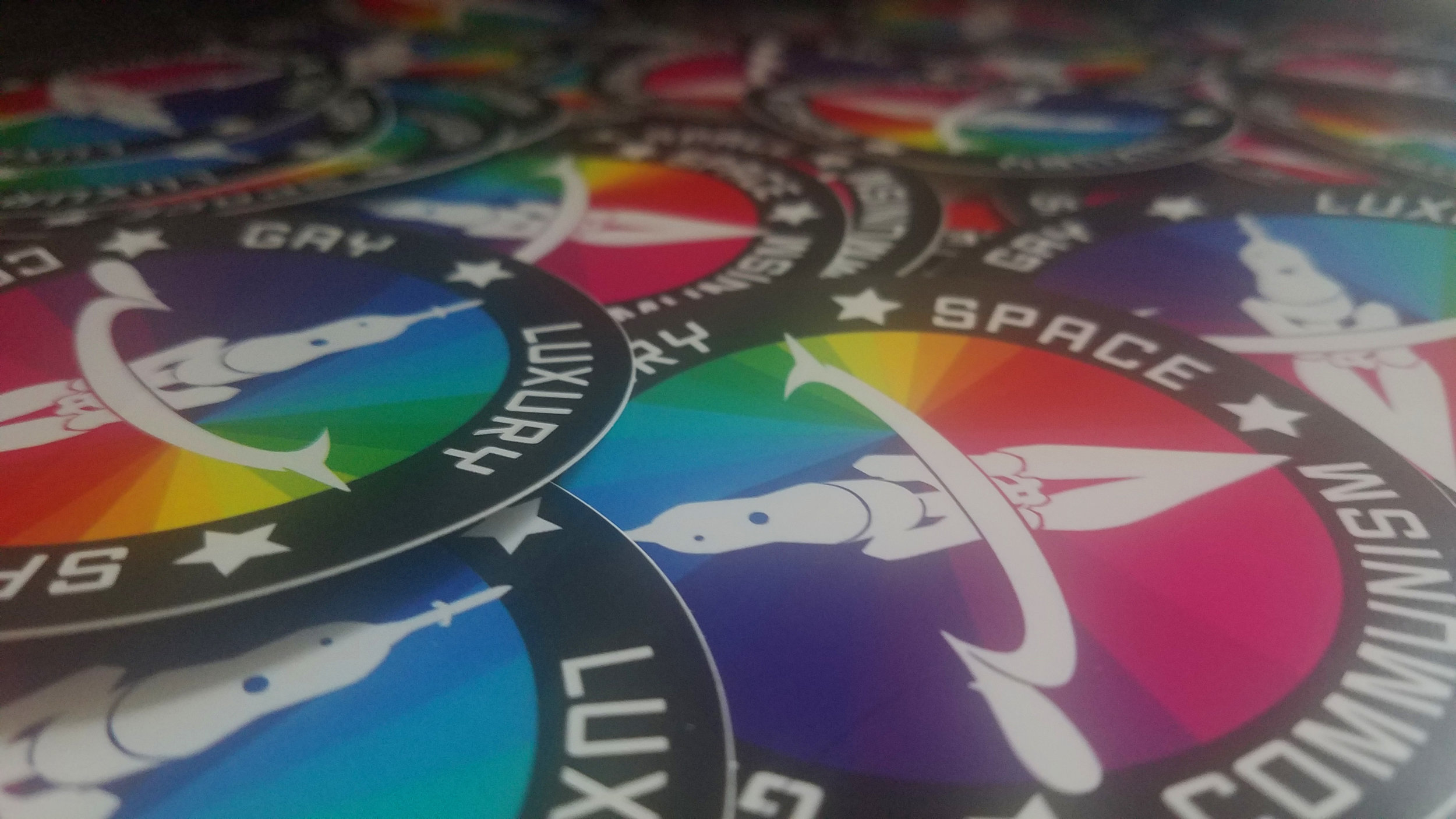
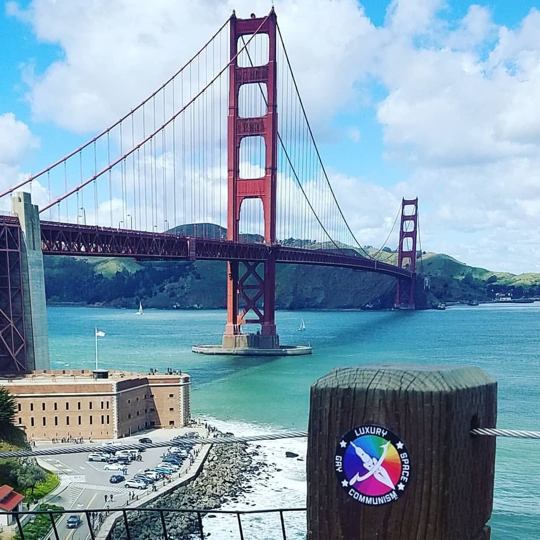
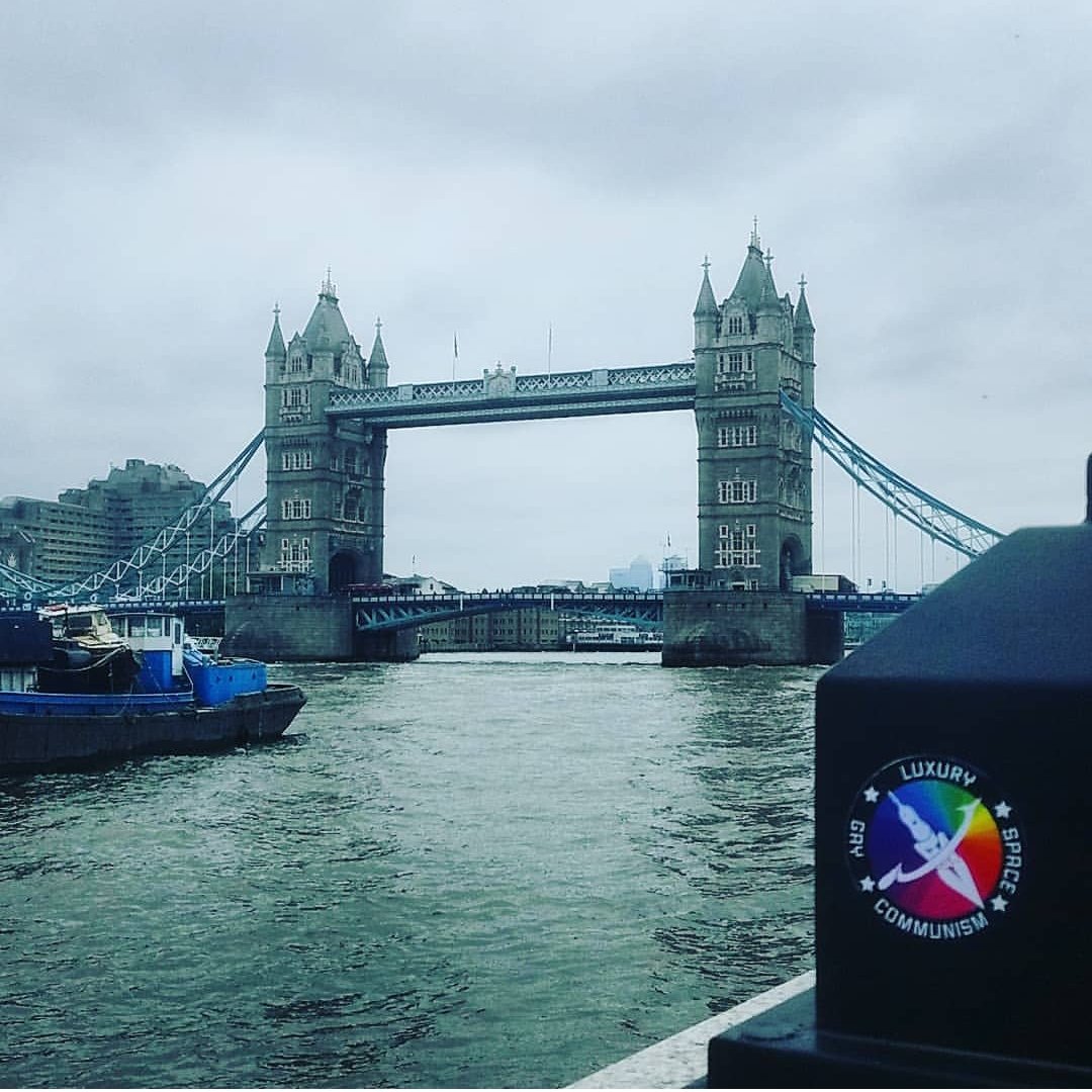
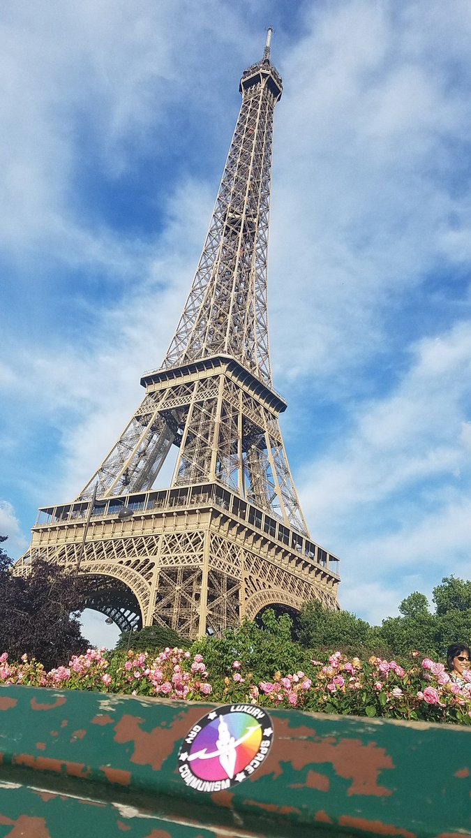

Since then I’ve mailed hundreds of patches and stickers all over the world, and still see the old rocket and sickle pop in new places I never expected. People tell me about all the conversations they start with people who they’ve never discussed leftist politics with before. I’m proud that people are able to use it to promote more than a goofy Star Trek future a ways off, but actual things people can do today to build their communities, and make life easier for everyone.
La Croix
A few summers ago I gave up sugary drinks. Desperate for a fizzy fix, I became intrigued, infatuated even, with La Croix. Not just the taste, but the branding itself. There’s nothing else quite like it, from the faux French name (intentionally mispronounced to rhyme with “enjoy” according to a since deleted page from their website), to the spindly disconnected cursive letters, to the brightly colored aquatic forms they swim in.
I also happen to hate tossing out single use plastic and aluminum with a passion. So I began hoarding every can I drank with the idea that I’d use them for an art project. That art picture became a series of photographs that tell a story of me, jumping in, being consumed by, and losing myself in a sea of La Croix. Edited to perfectly match the branding of a can of La Croix itself.
Click on the thumbnails below to see them full size.


I have since switched to making my own zero-waste seltzer with fresh fruit debris, but if National Beverage Corp ever wants to play ball, please give me a call.
Other Stuff
Client Work
Client Work
Client Work
Client Work
JK Design
JK Design is an agency that gets it. What differentiates them is as much about what they do as what they don't do. Concept and most of the words by me with some finishing touches and moral support from JK's Jim Galligan.
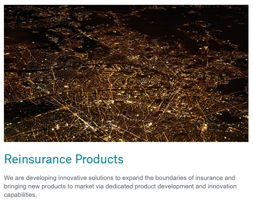
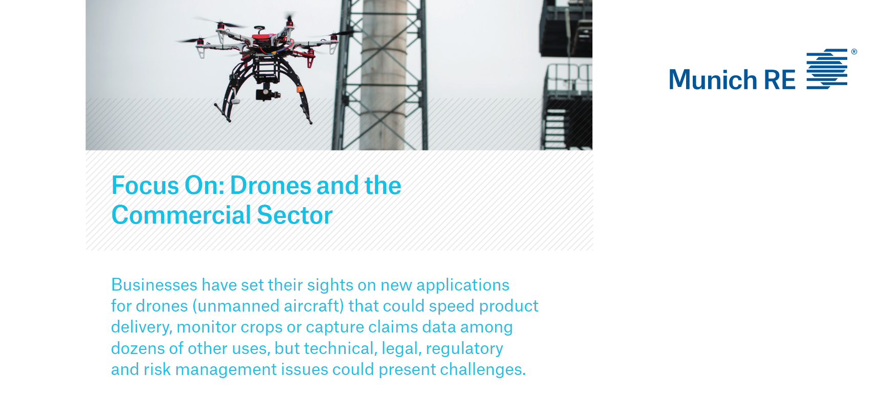
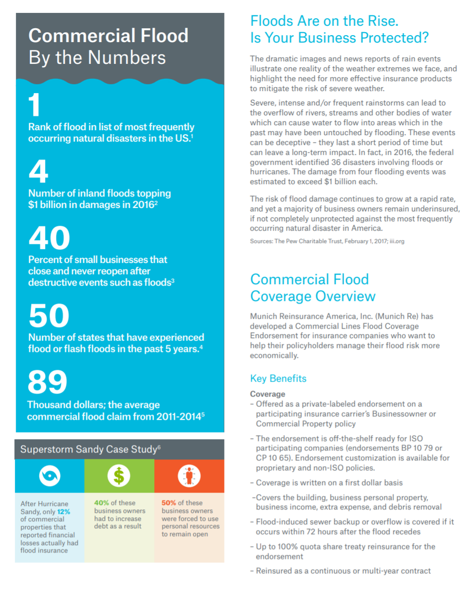
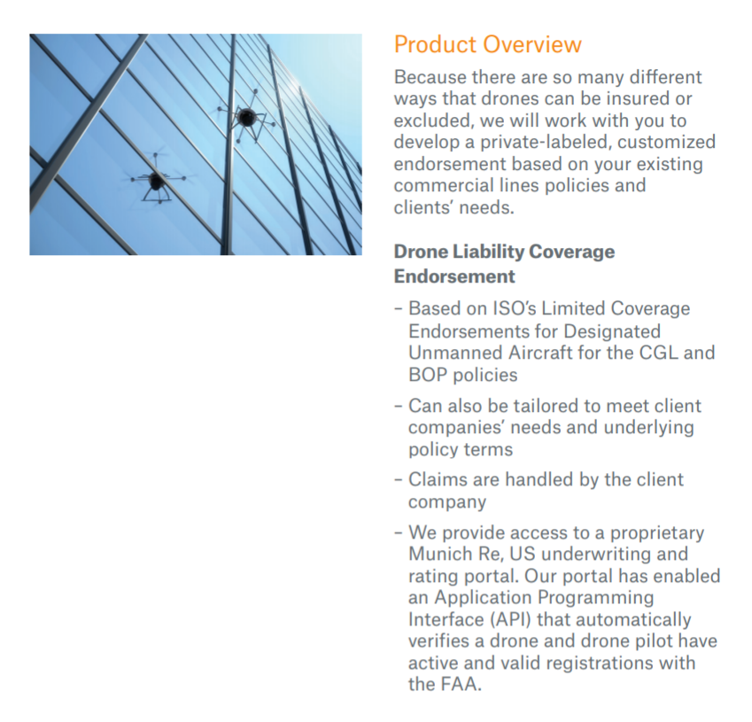
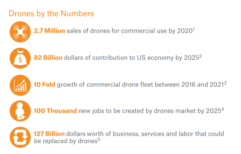
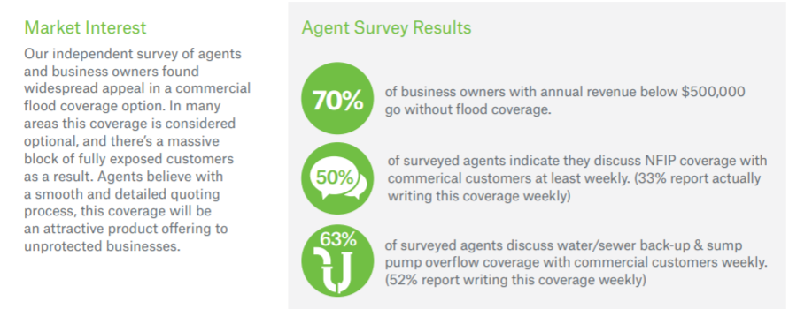
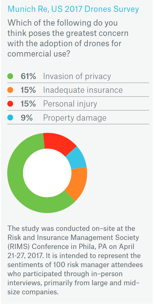
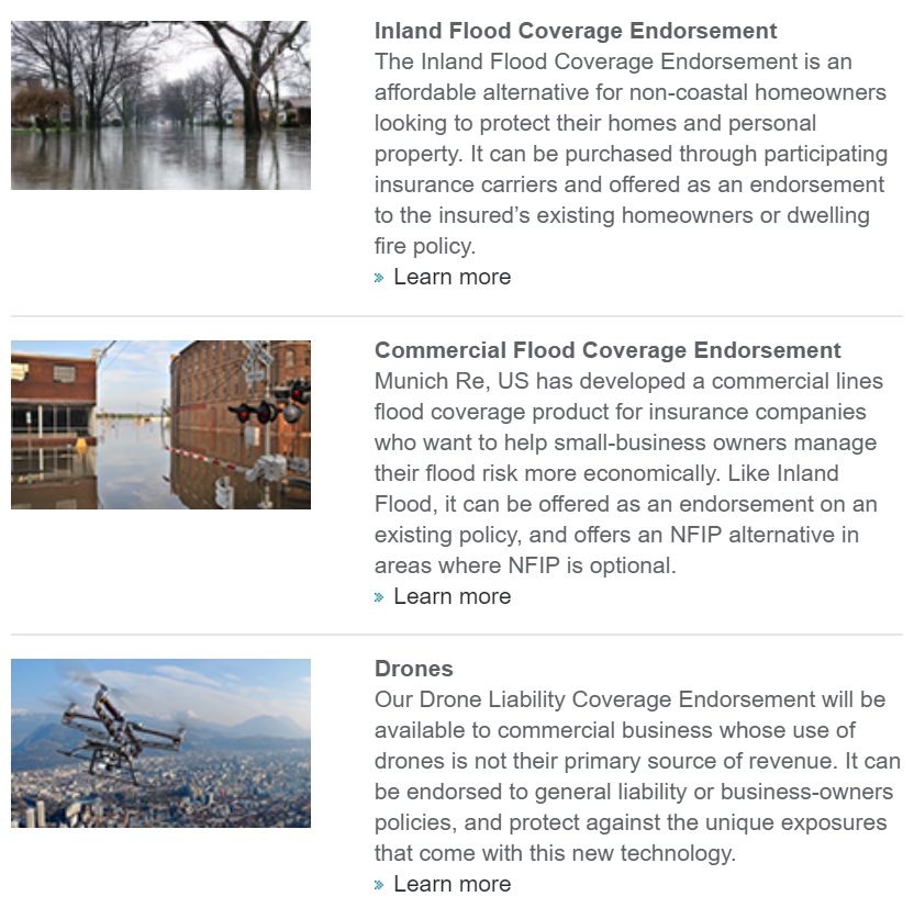
Munich, Re
In 2017 I worked with Munich Reinsurance of America's marketing department to, among other things, create a set of white papers for their new Reinsurance Products. The full set is nestled in the subpages here. Or you can click through the images below to read more.
Main Line Health
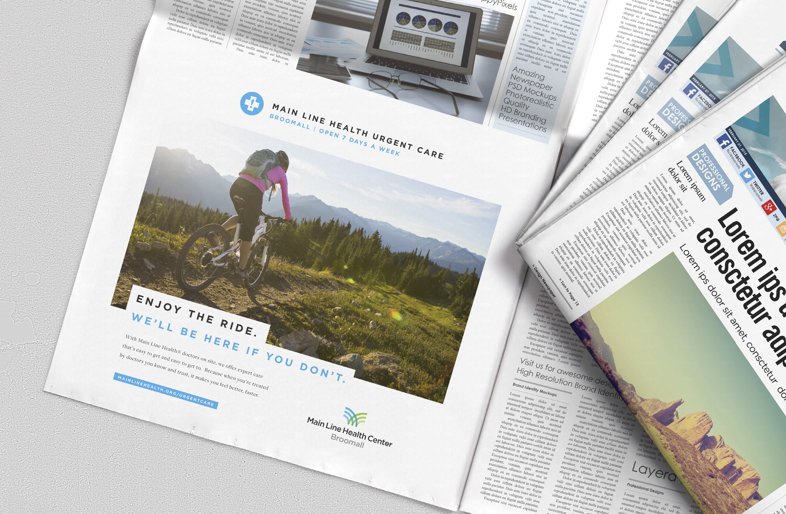
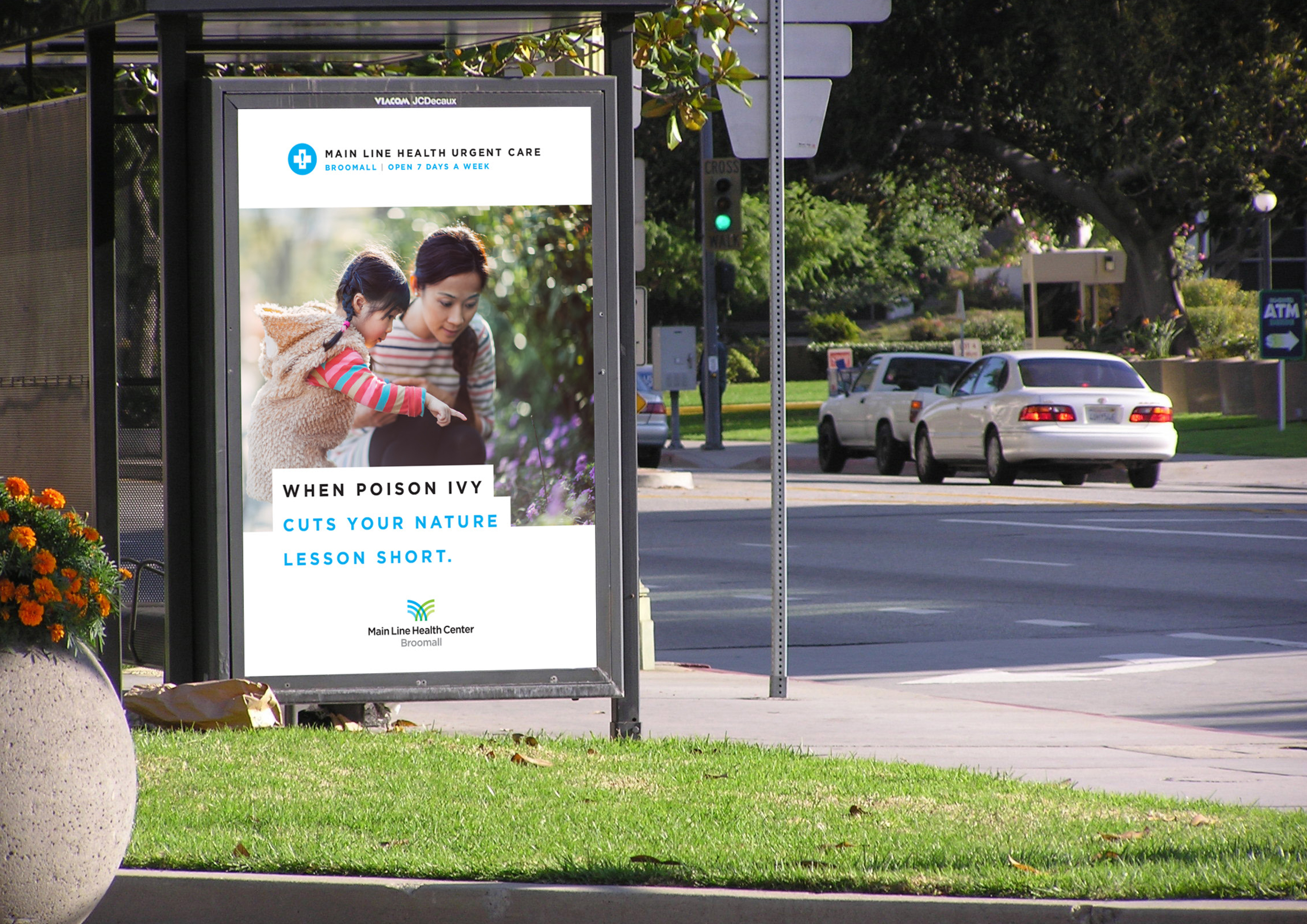

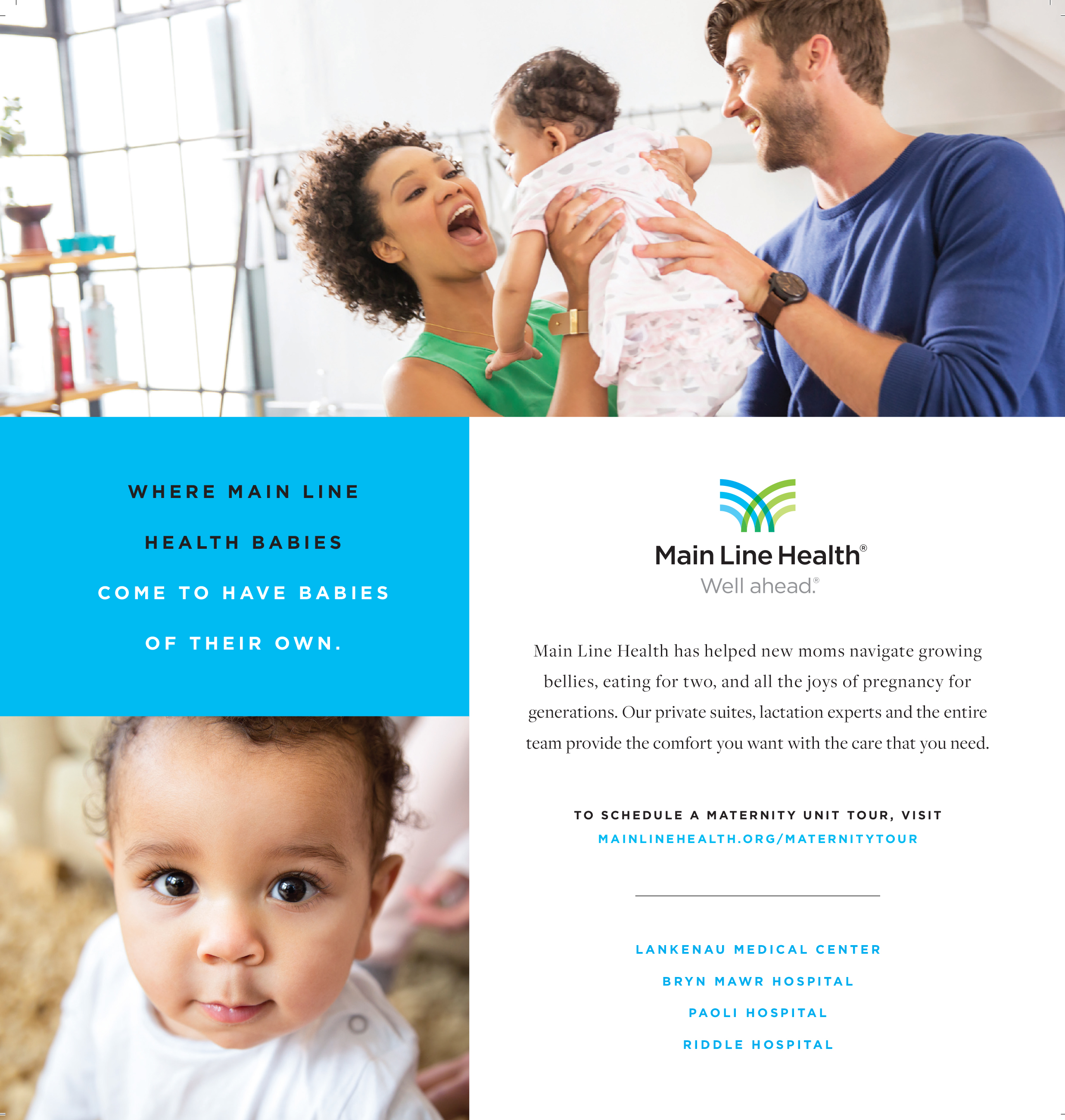
I've never seen anything quite like the identity and tone of Main Line Health done in health care before. It's genuine, completely unpretentious, serious when it needs to be, clever and even downright funny when it can afford to be. It's human, plain and simple. I was a fan before I had even met the people behind it.
I got to work on several campaigns within the MLH family, including Maternity, Urgent Care, Primary Care, and Lung Cancer, each with a different set of rules and ideas driving it. Above are some of my favorites.
Philadelphia Orchestra
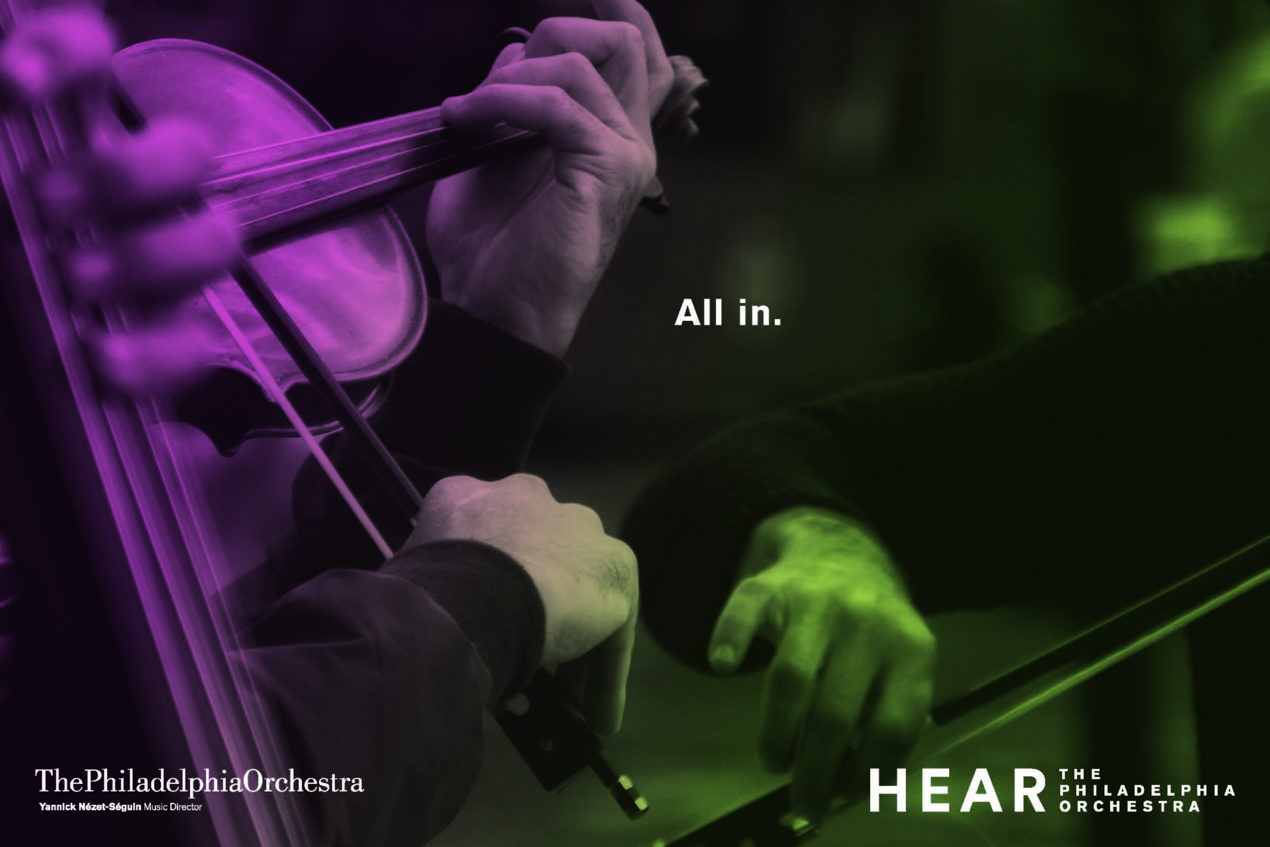
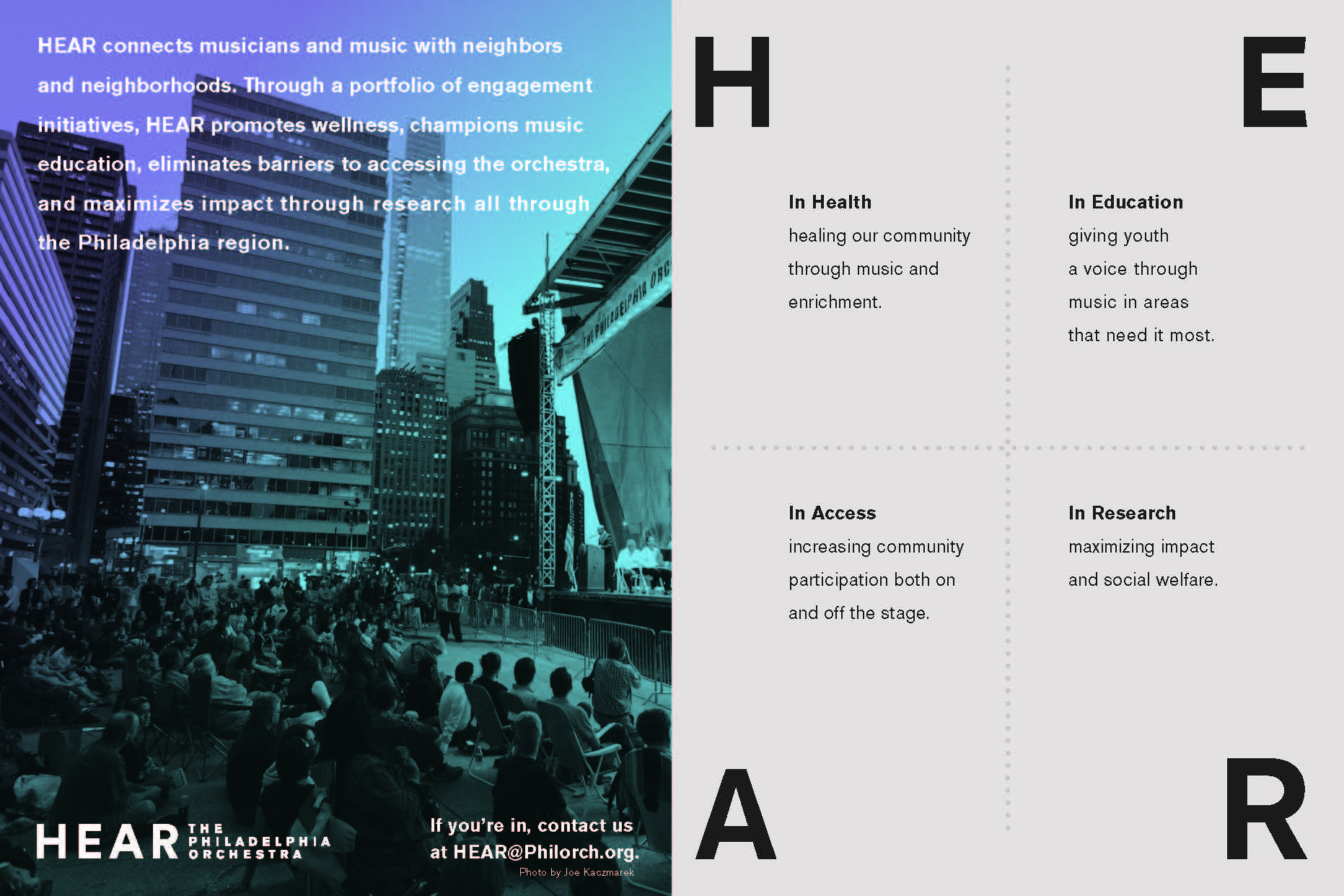
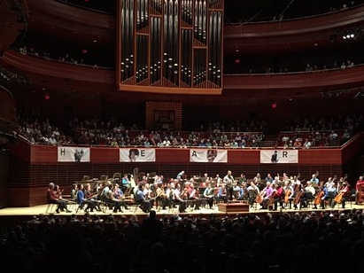
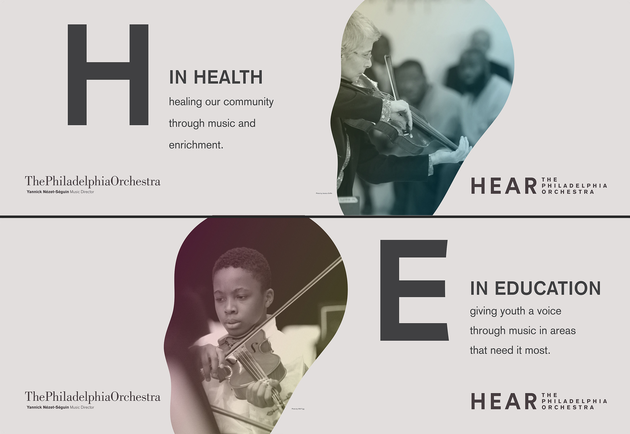
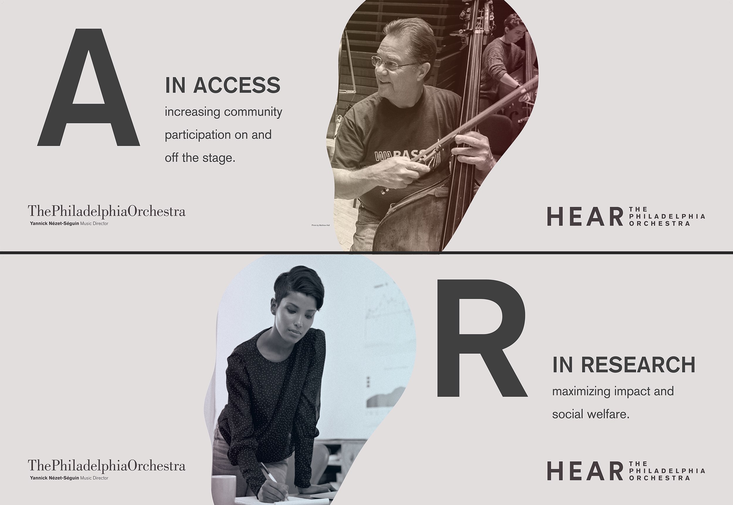
The Philadelphia Orchestra had us create a visual identity for their community outreach program, HEAR. This gallery includes the Bifold Brochure and banners that were displayed at the inaugural concert, a shot of the banners in action. The name and meaning of HEAR was decided before I touched it, but I created all the explanations, as well as the tagline "All In", a concise line that pulls double duty describing both the Orchestra's commitment to the community, as well as their goal of affecting the community in it's entirety.
Longwood Gardens
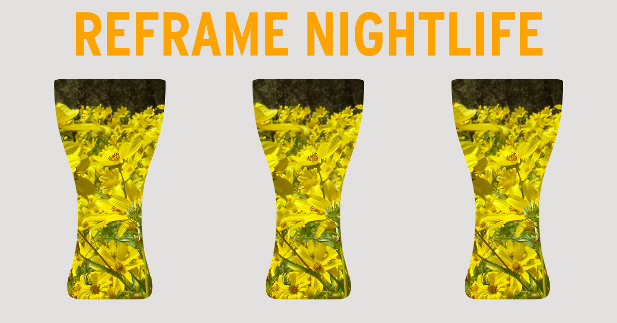
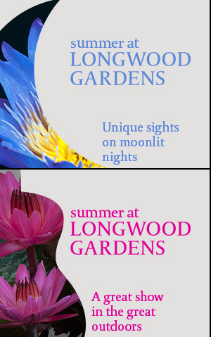
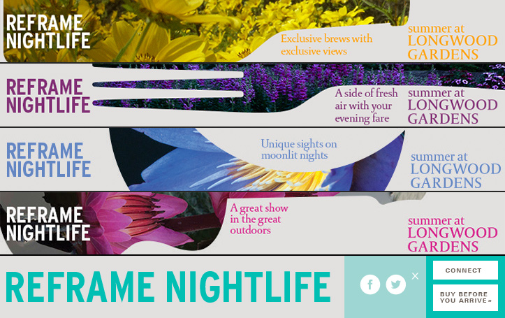
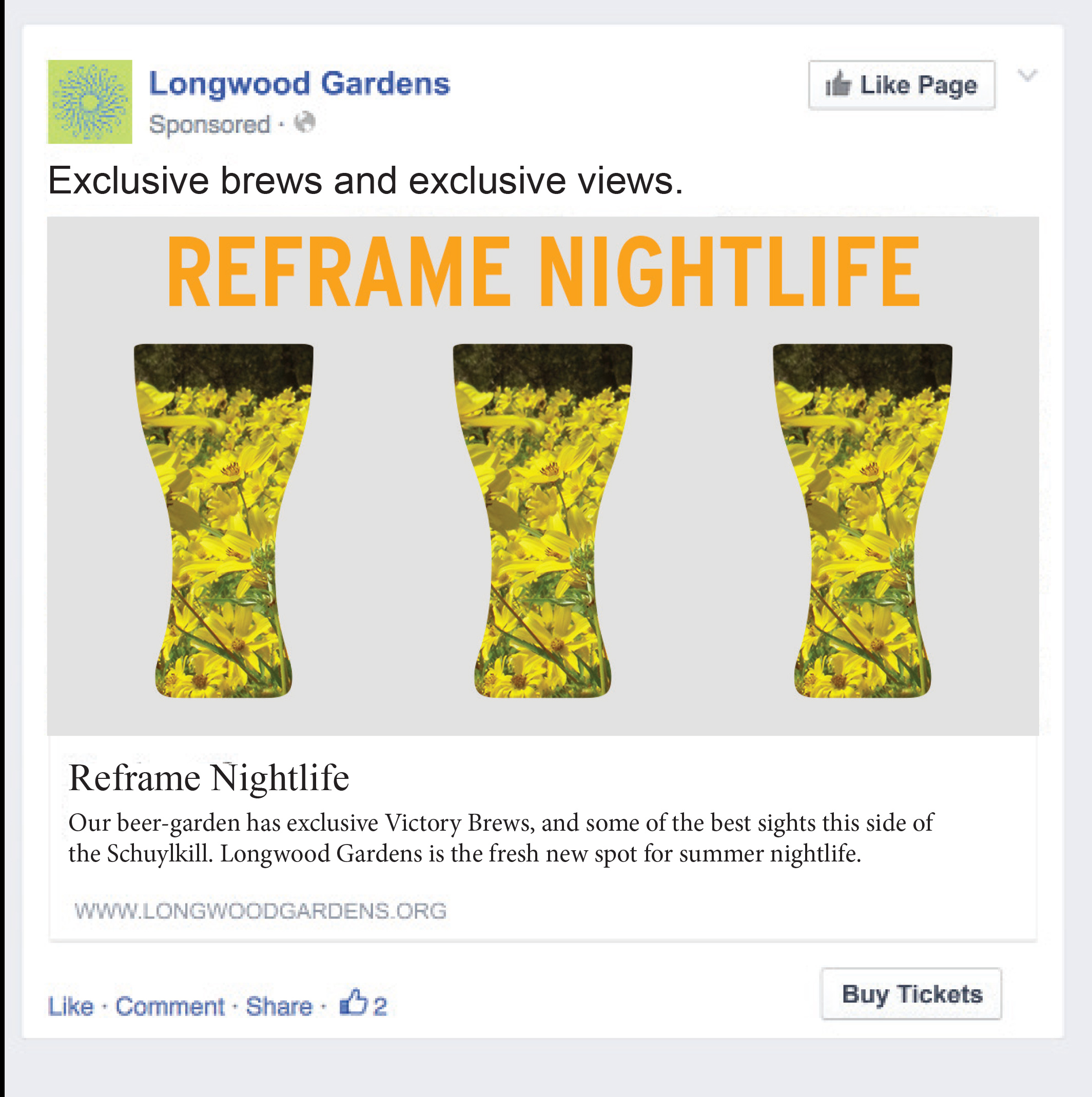
In 2015 Longwood Gardens added a new season between their Spring Blooms and their Nightscape event. Summer at Longwood would feature later hours, a beer garden with exclusive brews on tap, food, and live music under the sunset at one of the most beautiful gardens in the country.
Working with designer, Bernardo Margulis of This Makes Me Happy, we challenged people to find a new kind of nightlife at Longwood Gardens.
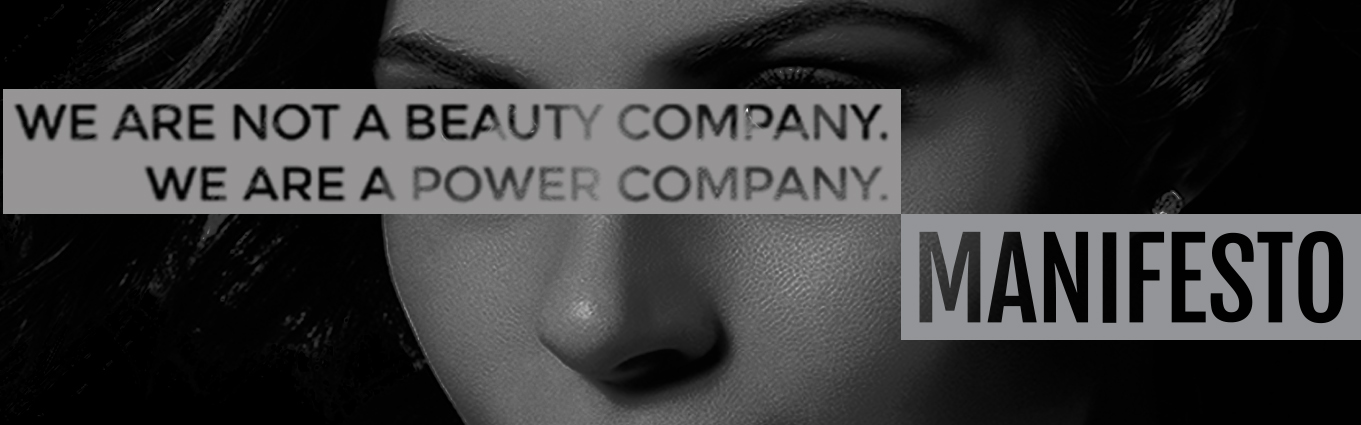
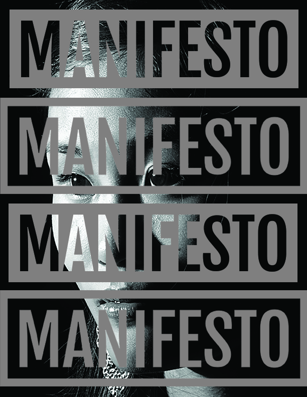
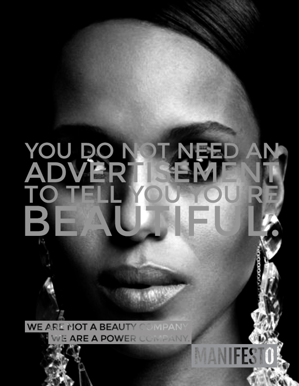
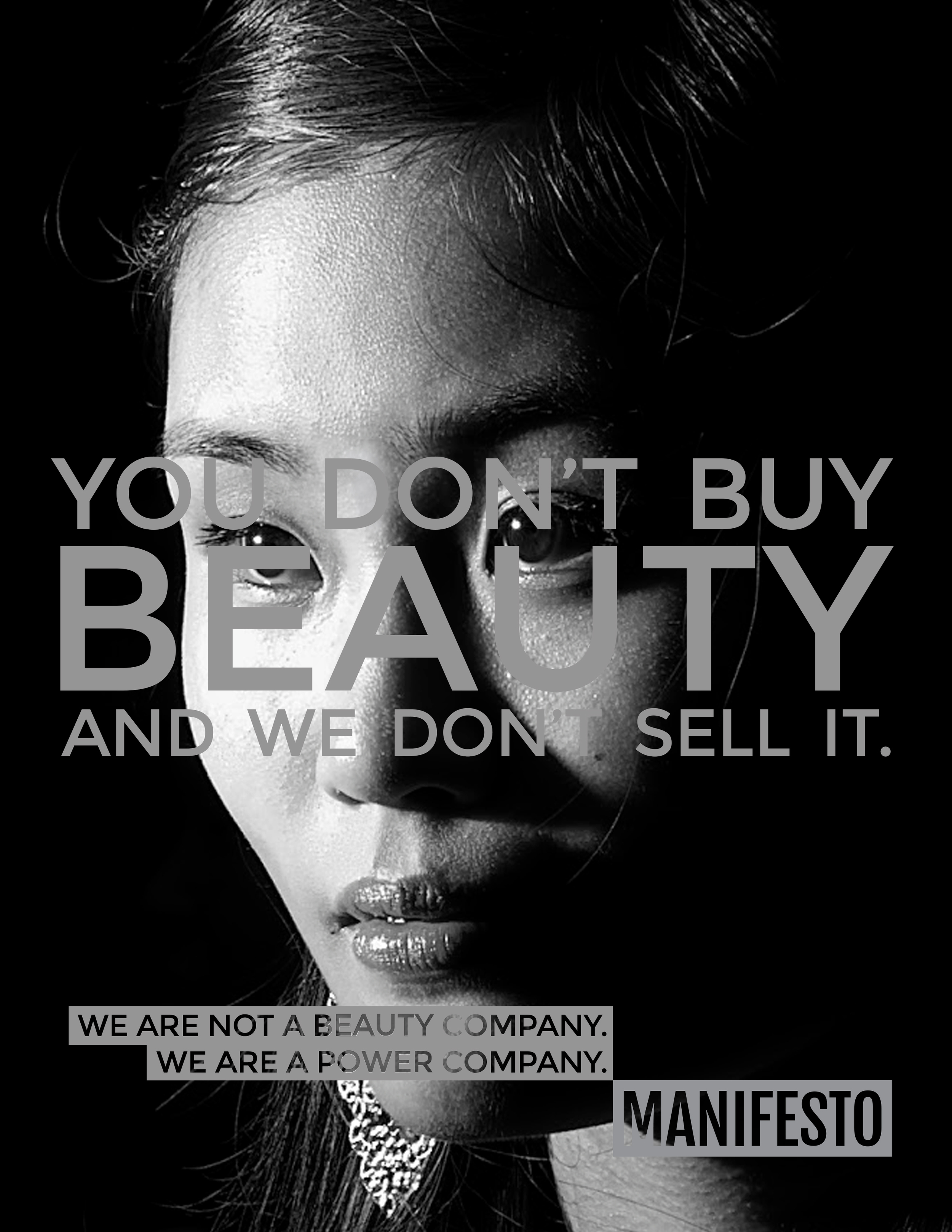
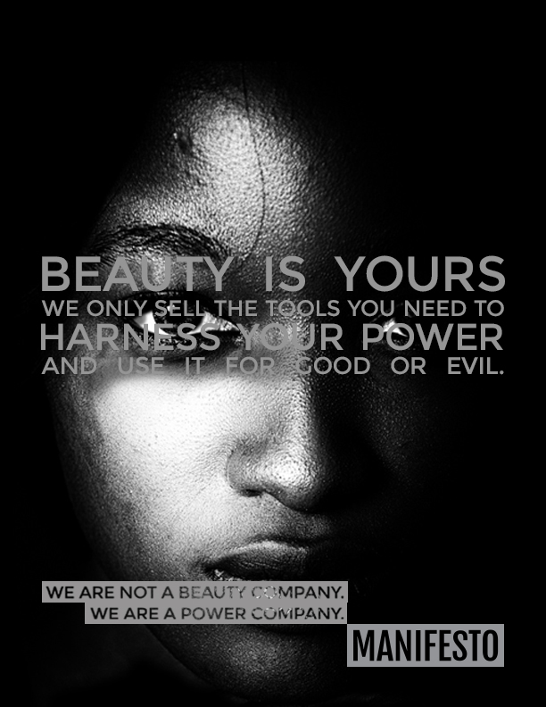
Manifesto
WE ARE NOT A BEAUTY COMPANY
Manifesto
WE ARE NOT A BEAUTY COMPANY
Inspired by the 150,000th ad I saw telling me I was beautiful, I muttered under my breath, "Dammit, I don't need an advertisement to tell me that." and began exploring what a beauty brand that didn't patronize it's customers so much might look and sound like. Can self-aware, no-bull beauty messaging subvert the ubiquitous body-image conversation and still make people want to buy cosmetics? I started writing out everything I found fundamentally flawed about beauty messaging and how a brand could avoid falling in these clichés. From this I developed a manifesto, and from that manifesto, a brand. So how does a brand that doesn't sell beauty still sell make up?
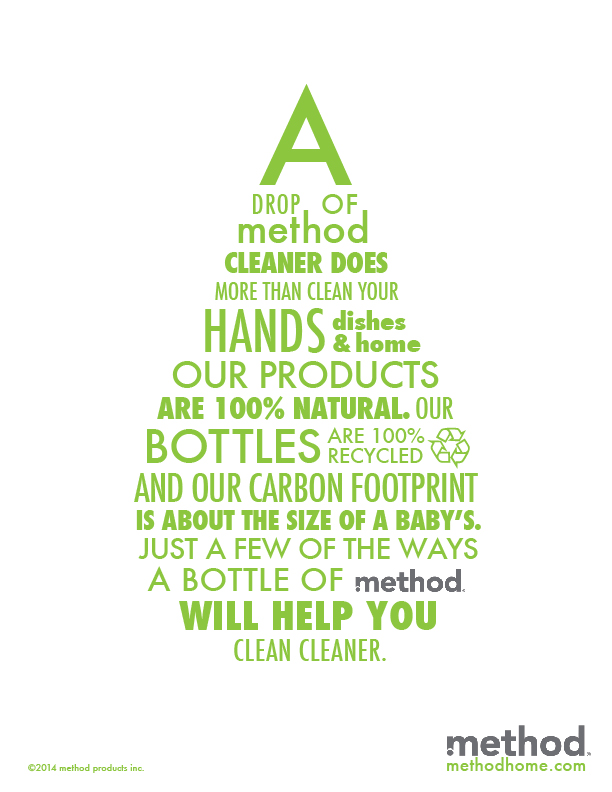
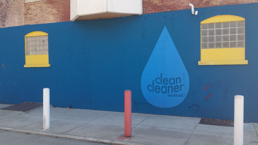
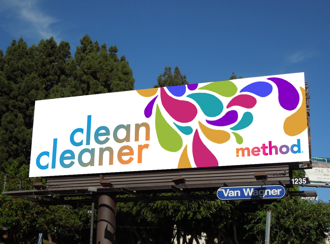
Method Campaign
A cleaner way to clean.
Method Campaign
A cleaner way to clean.
This campaign for Method Home cleaning products was all about the bottle. The recyclable plastic and people-healthy, earth-friendly ingredients makes for a much cleaner way to clean, but I wanted to keep the experience both conceptually and literally within the bottle. The unique Method tear-drop shaped bottle could easily be an icon of the industry, so I built the visuals of the campaign around it.


One-Offs
One-Offs and Whatnot
One-Offs
One-Offs and Whatnot
Click on images to enlarge


This traditional print ad gives the "Clean Cleaner" manifesto in a bright green drop shape with various sizes and weights of Futura. Click for the full size image,